Posts
Posts


Good covers will not do.
They must be GREAT covers!
Especially so with eBooks.
Here is the new cover for my RITES OF PASSAGE cover by the evocative genius, Leonora Roy.
http://www.amazon.com/RITES-OF-PASSAGE-ebook/dp/B004XQVPYM#_
It is now #14 and better, it is FREE for the next THREE DAYS. Do not miss it!
How do you like the cover for BURNT OFFERINGS, now at #37, also by the talented Leonora Roy?
http://www.amazon.com/BURNT-OFFERINGS-ebook/dp/B008N4QGA8/ref=pd_rhf_dp_p_t_1
But enough about me. What do you think of me? Seriously, back to covers ...
We DO judge a book by its cover. Covers are the first and many times, the only thing, by which potential readers of eBooks decide to try or not try.
Covers must ...
1.) HOOK THE BOOK
The cover must reach out and grab the viewer and tug her or him into reading the product description.
So you understand how important the product description also is!
If you can get her to download the sample chapters, your prose has a shot at snagging another reader.
2.) BE THE SOUNDTRACK OF YOUR BOOK
One image. It must sing the song of your genre. "GIVE ME THE SAME THING ...
ONLY DIFFERENT," said the famous studio head, Samuel Goldwyn.
Look at the covers of the genre you're writing. Study them. DO NOT be like them.
What? Sure, if your cover is like theirs, the eyes of the potential readers will skim right over yours, not truly seeing it. SAMENESS IS DEADNESS with covers.
3.) BE THE POSTER FOR THE MOVIE OF YOUR BOOK
It must catch the "feel" of your book, giving a fair hint of all the fantastic things within the pages of your book.
Unless you are Stephen King, your name will not sell the book. BUT A GREAT TITLE WILL GRAB ATTENTION.
So highlight an evocative title so that it is spotlighted in the reader's mind.
Consider the titles to my covers in my sidebar.
4.) THE DEVIL IS IN THE DIGITAL DETAILS
In this digital age, our covers must be evocative in a thumbnail and in full-blown format.
Harder than it seems.
Two lovers entwined on the grass can look like twigs on vomit in thumbnail (really not an image guaranteed to get buyers!)
5.) OBSCURE THAT FOR ME PLEASE!
Ambiguity of setting aids you snaring the reader.
What? Yes.
Your cover sets the mystery of your book for the reader. The background becomes a literal character in your book for the browsing reader, murmuring, "You want to know more about this, don't you?"
Do not tell everything in your cover.
Why then would someone want to read when they already know the punchline?
Look at the covers of my novels in the sidebar. They suggest. They evoke. (I hope!)
6.) EXCUSE ME. IS THAT AN OVER-BITE, OR ARE THOSE FANGS?
Beauty is fine, but there must also be the promise of danger, of deadly threat. In a split second, the viewer will either be drawn to your book or decide to pass.
The threat of mysterious danger is essential in having the viewer come to the desired decision.
7.) TEASE BUT DON'T BE MEAN
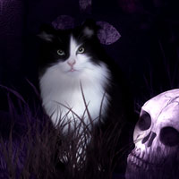
If a black cat is the major focus of your cover, there had better be a mysterious black cat in your novel ... or you just lost a loyal follower.
8.) I SAID "BE BOLD" NOT "BE BALD!"
Humphrey Bogart said to Yul Brenner years later when Yul said he followed Bogart's advise on how to succeed in the movies.
Be bold. Consider your font.
Did you know that handwritten fonts appeal to women readers? Studies indicate they do. But only for contemporary romantic fiction. Be aware of your market's trends.
Destroyed fonts (damaged lettering) draw in the crime reader.
Popular Apoolyptic novels employed an over-all "distressed" layering to their cover image.
That's all I have room for. A whole book could be written on how to do a great cover. What do you think of my two latest?
They must be GREAT covers!
Especially so with eBooks.
Here is the new cover for my RITES OF PASSAGE cover by the evocative genius, Leonora Roy.
http://www.amazon.com/RITES-OF-PASSAGE-ebook/dp/B004XQVPYM#_
It is now #14 and better, it is FREE for the next THREE DAYS. Do not miss it!
How do you like the cover for BURNT OFFERINGS, now at #37, also by the talented Leonora Roy?
http://www.amazon.com/BURNT-OFFERINGS-ebook/dp/B008N4QGA8/ref=pd_rhf_dp_p_t_1
But enough about me. What do you think of me? Seriously, back to covers ...
We DO judge a book by its cover. Covers are the first and many times, the only thing, by which potential readers of eBooks decide to try or not try.
Covers must ...
1.) HOOK THE BOOK
The cover must reach out and grab the viewer and tug her or him into reading the product description.
So you understand how important the product description also is!
If you can get her to download the sample chapters, your prose has a shot at snagging another reader.
2.) BE THE SOUNDTRACK OF YOUR BOOK
One image. It must sing the song of your genre. "GIVE ME THE SAME THING ...
ONLY DIFFERENT," said the famous studio head, Samuel Goldwyn.
Look at the covers of the genre you're writing. Study them. DO NOT be like them.
What? Sure, if your cover is like theirs, the eyes of the potential readers will skim right over yours, not truly seeing it. SAMENESS IS DEADNESS with covers.
3.) BE THE POSTER FOR THE MOVIE OF YOUR BOOK
It must catch the "feel" of your book, giving a fair hint of all the fantastic things within the pages of your book.
Unless you are Stephen King, your name will not sell the book. BUT A GREAT TITLE WILL GRAB ATTENTION.
So highlight an evocative title so that it is spotlighted in the reader's mind.
Consider the titles to my covers in my sidebar.
4.) THE DEVIL IS IN THE DIGITAL DETAILS
In this digital age, our covers must be evocative in a thumbnail and in full-blown format.
Harder than it seems.
Two lovers entwined on the grass can look like twigs on vomit in thumbnail (really not an image guaranteed to get buyers!)
5.) OBSCURE THAT FOR ME PLEASE!
Ambiguity of setting aids you snaring the reader.
What? Yes.
Your cover sets the mystery of your book for the reader. The background becomes a literal character in your book for the browsing reader, murmuring, "You want to know more about this, don't you?"
Do not tell everything in your cover.
Why then would someone want to read when they already know the punchline?
Look at the covers of my novels in the sidebar. They suggest. They evoke. (I hope!)
6.) EXCUSE ME. IS THAT AN OVER-BITE, OR ARE THOSE FANGS?
Beauty is fine, but there must also be the promise of danger, of deadly threat. In a split second, the viewer will either be drawn to your book or decide to pass.
The threat of mysterious danger is essential in having the viewer come to the desired decision.
7.) TEASE BUT DON'T BE MEAN
If a black cat is the major focus of your cover, there had better be a mysterious black cat in your novel ... or you just lost a loyal follower.
8.) I SAID "BE BOLD" NOT "BE BALD!"
Humphrey Bogart said to Yul Brenner years later when Yul said he followed Bogart's advise on how to succeed in the movies.
Be bold. Consider your font.
Did you know that handwritten fonts appeal to women readers? Studies indicate they do. But only for contemporary romantic fiction. Be aware of your market's trends.
Destroyed fonts (damaged lettering) draw in the crime reader.
Popular Apoolyptic novels employed an over-all "distressed" layering to their cover image.
That's all I have room for. A whole book could be written on how to do a great cover. What do you think of my two latest?