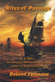
 Your eBook cover is like a Bikini ...
Covering the bare essentials while teasing with promises of mysteries to be unveiled.
A compelling cover design that captures your story and genre while still standing out and being special is a must!
The cover and blurb power combo will get readers to pick you your book.
Your writing should get them to see it through to the end.
The cover has to still look good and be readable in thumbnail size since people will be browsing on their phones, their e-readers, online etc.
Cover art is one of the most effective marketing tools an author can use.
You brand yourself with that image and it will be seen over and over again in conjunction with whatever promotion you do for your work.
Buyers WILL judge your book by its cover - because they have to!
Apart from the sales copy on your web page, the cover of your ebook is the only thing they've got to go on when deciding whether or not to buy.
1: The Title
Your ebook title needs to be short and punchy.
Thumbnails are cruel to long titles. I, of course, have to be different!
But you, my friends, have to write tight!
2: Choice of fonts
Ebook covers are small so you need to use fonts that are compact and easy to read.
3: The Illustration
An ebook cover that's just plain text can be pretty boring.
An image will liven up your design.
Whether you use a photo or some other graphic, the image you use needs to key into the theme of your ebook and help to get your message across.
4: Color
Color is another useful tool in the design of your ebook cover. Colors have their own energies - red is forceful, blue is conservative, green is calming, yellow is exciting, and so on.
Pick one main color that ties in with the theme of your ebook and use other colors sparingly. Like fonts, using too many can obscure your message.
5: Image quality
Your cover image must be razor sharp and crystal clear to sell your ebook! Too many of the ebook images you see on the Internet are fuzzy and flat.
One way to get good image quality is to design at a larger scale that the final image size. it's easier to work on and reducing the design to the required size will enhance its clarity.
People WILL judge your ebook by its cover so design it well. Remember, the better the cover, the bigger the sales!
So?
What do you think of Leonora Roy's new cover for ADRIFT IN THE TIME STREAM?
http://www.amazon.com/ADRIFT-THE-TIME-STREAM-ebook/dp/B004XZUY4U


Ooh! That's my favorite cover yet from you. Nice example!
ReplyDeleteThanks, Colleen:
ReplyDeleteI, too, think that Leonora out-did herself with her rendition of Lady Meilori!
Well said, Roland! :)
ReplyDeleteThanks, Carrie:
ReplyDeleteI tried to give specific things to keep in mind and shoot for when creating your covers. I'm really pleased you liked my post tonight!
I agree covers have to do so much work in selling your book. Great post.
ReplyDeleteVery useful information Roland and the cover is wonderful. Leonora is a talented artist. I am lucky that I have two talented daughters that I can use when the time comes. Great cideo as well. Samuel is such a hunk!
ReplyDeleteI've been fortunate that the covers my publisher made have rocked. Or, at least I think so...
ReplyDeleteSuzane:
ReplyDeleteI'm glad that you got something out of my post. Covers are our ambassadors to the world so we are wise to dress them well!
Siv:
Sam just tipped his Stetson to you! Leonora is a wonder, isn't she? I can't wait to see what your daughters create as a cover for you. Wendy Tyler Ryan did a magnificent video for Sam. I know she is pleased that you like it. Have a wonderful end of week.
Alex:
Your covers have been riveting and eye-catching. One of the truly scary things about being published by a publisher is that both cover and title are their choices not yours! Brrr! I am really pleased at your UK success! :-)
Leonora did fabulous work on your cover. Btw, your book trailer is also great, well done. :)
ReplyDeleteI just had to hop over from fb and say hi. You said you missed me!! Your blog is the only one I've hit in 9 days. I'm really going through blog-withdraw, but if I don't stay strong, I'll never get CUFFED written. I'm at 11k with Camp Nano, and 32k for the entire book. I've just hit the summit of my mountain, now for the ride down the other side. Almost halfway there. I'm shooting for 65-70k total.
I'll tell you something funny. Three days ago, my story took a turn for screwy. My mc (woman) decided, unbeknown to me, to be attracted to one of her fiance's work partners. Now, before you shake your finger at her, her relationship was on the down slide anyhow. But now, my story is headed in a new direction. Don't you find it interesting how our characters really do have minds of their own?
I'm not finding too much support at the camp nano website or the fb group. There's one gal who chats with me, but other than that I'm the lone writer, swimming upriver, without a paddle. Just me, flailing around, gulping & choking on water. Yuck. But, give me a challenge, and I'll beat it. At least I have my tenacity--it'll see me through to the other side.
Hope all my bloggy friends are still around when I come up for air. Miss ya, too. :)) ~Candy
Candy:
ReplyDeleteLeonora did out-do herself this time, didn't she?
Thanks for visiting my cyber-home. It was emptier for not dropping by. Your characters if they are well-written will take turns that surprise you. So you are creating life-like people in your tale.
Hate to hear that you are not finding support at Camp Nano. To too many, this is some kind of fierce competition which alienates more than connects writers to one another.
Yet, the ghost of Ernest Hemingway just said that it is good for you to be alone ... that writing is a solitary quest, hammering at the author as he or she hammers at the keys of keyboard. He told me that no good novel was crafted by committee. He wanted me to assure you that you would grow stronger from this ... that it is the struggle of the journey, not the destination, that is important.
Your true friends will still be here when you come back. Me at the head of the group, Roland
Wow! THAT is a catchy title, Roland. You are a master with titles as well as with prose. Hope life is treating you well during these HOT HOT summer days.
ReplyDeleteI read your above comment to Candy. It's true. Great works are written in solitude, not in "committees" or "workshops." They can stimulate if the group is good, but Candy's group doesn't sound good. Still, as you told her, she will have learned from it, if nothing else than to look for support elsewhere, mainly IMO from reading the great writers, including you. I sincerely mean that! Your writing is some of the most lyrical writing I have ever read!!
Another sweet cover, Roland. I've also found that it's important to use only commercial-use fonts -- had to pay a font creator $25 for his font back in March when I neglected to read the fine print!
ReplyDeleteThanks, Anne!
ReplyDeleteI am just now dragging in from my day as a rare blood courier! This weekend I am on call then onto working straight thru next week. Ouch!
Your kind words about my writing really makes my weary evening!
I don't know if there is a market for lyrical writing anymore. Basically, it is a 50 SHADES OF GREY erotica market it seems these days.
Solitary writing is hard as Candy is finding out. I'm happy you think my musings are on the right track there@ :-)
Milo:
Definitely! Being a selp-published writer can be tricky these days!!
Yay, I can comment now! Maybe the problem was with my work computer...who knows. I love comparing covers to bikinis! Hee hee. And I like this cover a lot. The red is very eye-grabbing. That's a late night for you and I hope you get a good night's rest!
ReplyDeleteJennifer:
ReplyDeleteI made myself smile when I compared covers to bikinis!! Leonora's use of red is indeed very eye-catching, isn't it? All my days are long and late. Sigh. I need to sell the movie rights to Victor or Samuel. Maybe with Maggie Q as Meilori? :-)